Visual Identity
Substrat
Building an identity from the ground up
Services
Visual Identity
Field of activity
Aerospace & Sustainable Engineering
Date
December 2025
Tools
Figma
The starting point
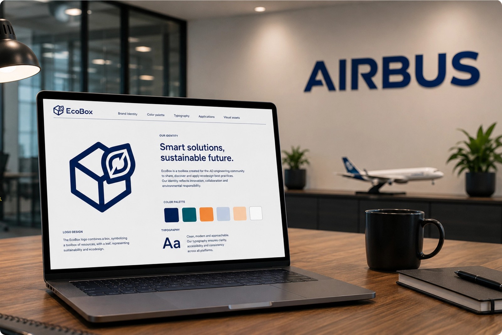
Ecobox is an internal Airbus initiative designed to support engineers in integrating ecodesign principles into their projects. The platform centralizes resources, methods and environmental assessment tools into one accessible ecosystem. The challenge was not only to create a logo, but to build a complete visual identity capable of translating technical complexity into a clear, intuitive and modern experience. The identity had to reflect both Airbus standards and the environmental ambition behind the project.
The Mission
Design a visual identity system that feels structured, recognizable and scalable across digital platforms. The objective was to create a brand that could instantly communicate three core ideas: a toolbox of engineering resources, sustainability and ecodesign and product lifecycle thinking. The final identity needed to remain simple enough for web integration while being strong enough to exist as a standalone Airbus internal product.
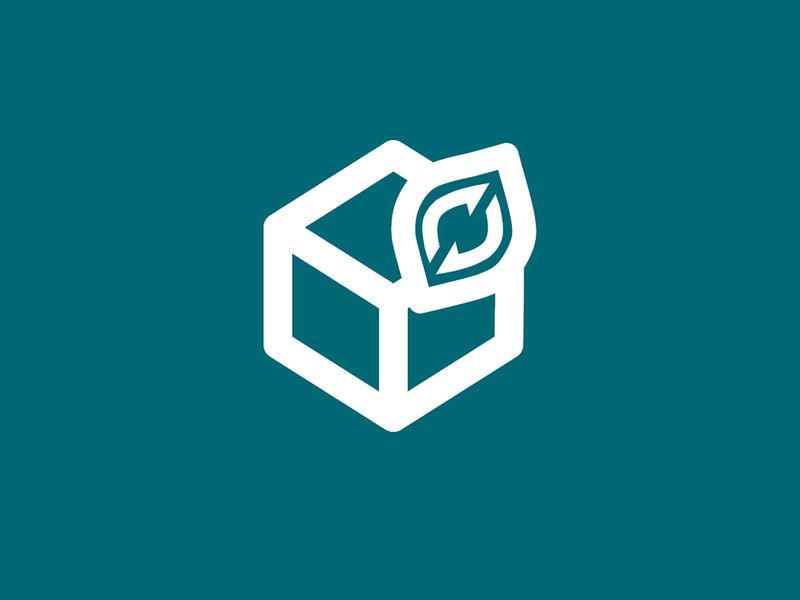
Color palette
The complexity
The main difficulty was balancing clarity and symbolism without overloading the logo. Several iterations revealed recurring issues: too much visual complexity, weak sustainability references, poor readability at small sizes, and limited adaptability for digital interfaces. Another challenge was designing within Airbus visual standards while still giving Ecobox its own distinctive personality and modern ecosystem feel. The identity also had to work consistently across: web interfaces, training modules, databases, internal tools, and presentation materials.
What we built
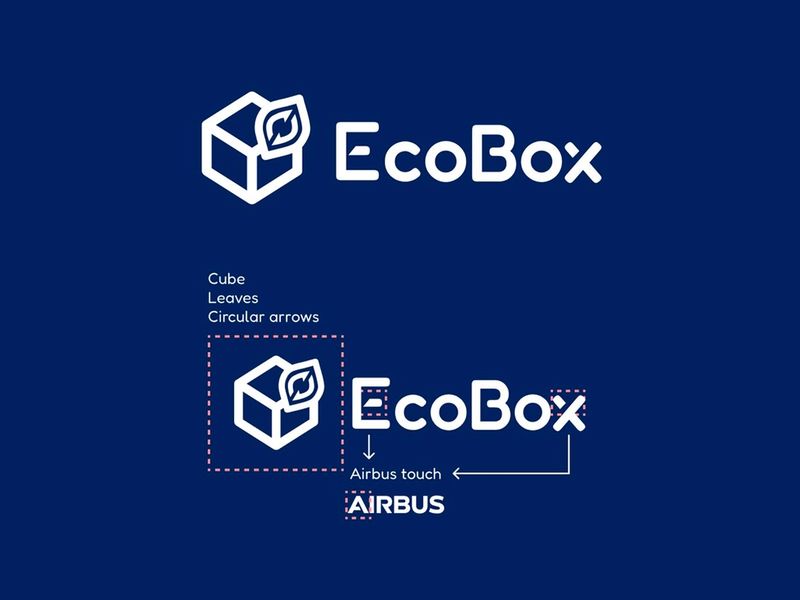
The final concept was built around three symbolic elements: the cube, representing the toolbox and the organization of resources, the leaf, embodying the sustainable dimension of the project, and the circular arrows, symbolizing the product lifecycle and ecodesign principles. The visual identity was designed to be minimalist and modular in order to ensure readability, adaptability and consistency across all digital platforms. The color palette was selected in alignment with the Airbus design system to ensure a seamless integration within the existing digital ecosystem, while bringing a more modern and sustainable dimension to the Ecobox identity.
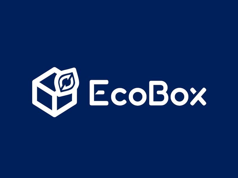
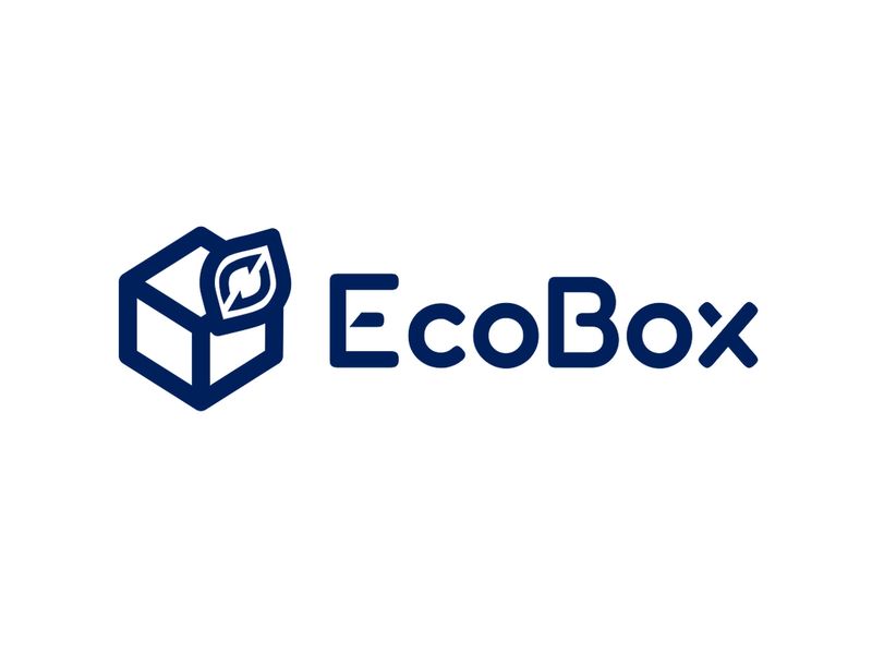
Final result
Testimonials
Alycia was part of a small project team I led for the creation of an internal digital platform. She took care of the entire UX/Ul design for this project and did highly valuable work. Her contributions were key to the progress of the project, which has now been successfully deployed and is getting very positive user feedback. Working with Alycia was always a pleasure! She is professional, friendly, open to ideas and discussions, and possesses a great team spirit. I am more than happy to have worked with her, and I recommend her without hesitation!
Ecobox - Visual Identity
December 2025
Want to see more?